Gear Up for Graduation!
Every year in May and June they come. The graduates.
From kindergarteners to PhDs, thousands of them line up in caps and gowns. And there in the audience, cameras clicking away, you’ll see their loved ones, smiling with pride. And then, there are the ones like me—scrapbookers, imagining all that pomp and circumstance arranged on a scrapbook page.
Capturing This New Adventure
Not too long ago that was me. I attended the graduation, snapped a boatload of photos, and created a 2-page layout to celebrate my nephew’s new adventure.
Today, I’ll show you the steps I used to create this layout. I go into a bit of detail; so if you’re not looking for how-to information, just skim through it to pick up a few tidbits.
Four Steps
In today’s post, I’ll share the 4 basic steps I used to create this 2-page graduation layout. I’ll tell you about the snags I ran into and how I solved them. And maybe you’ll pick up some tips you can use in your next graduation layout.
The Basic Steps
- Select and sort your pictures
- Choose papers that compliment your photos
- Decide the best photo layout, and
- Add a few killer details
1. Select and Sort
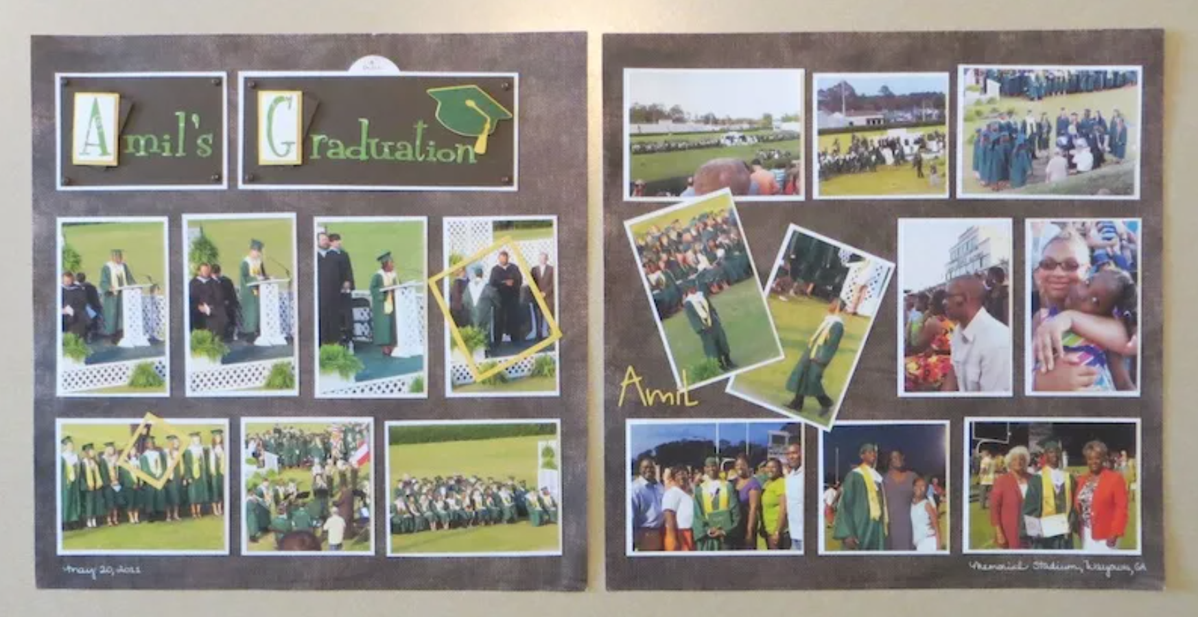
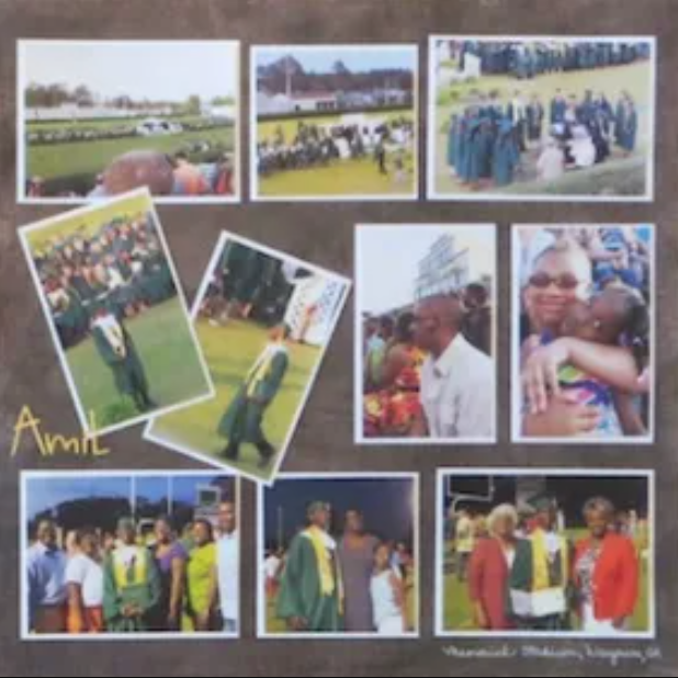
You probably snapped tons of photos and now have to decide how to use them. I had so many photos that I considered creating a separate album just for the graduation photos. But I decided to create a 2-page spread for my “family yearbook” scrapbook, using the most important images.
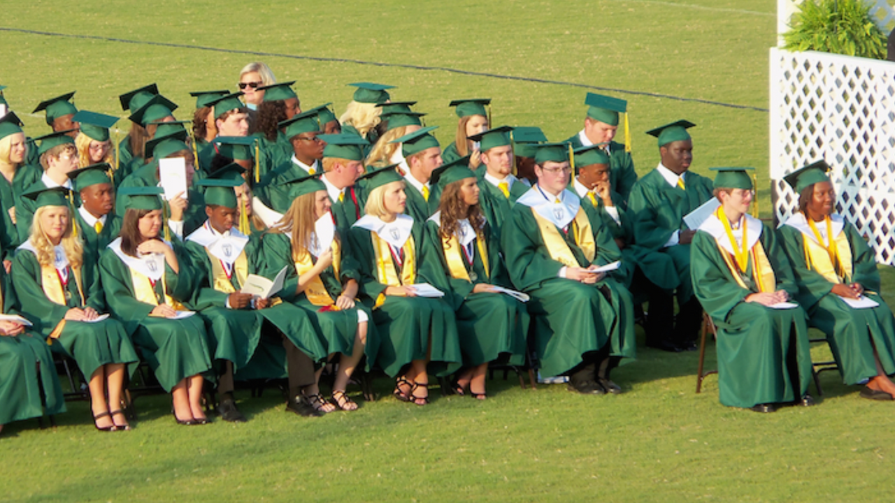
You’ll notice that I used a LOT of photos and created a pretty busy layout. You don’t have to do that. But graduations involve lots of graduates, audience members, officials, and busy details like chairs, diplomas, and those caps with tassels.
Busy, Busy
There’s bound to be some “busyness” in a graduation layout unless you restrict yourself to using just a few photos. Or you can focus on your graduate and skip most of the crowd shots. Just do what makes you happy. Your scrapbook doesn’t have to impress anyone but you!
I decided to live with some of the visual busyness. I did crop my photos to remove some distracting details, though.
2. Choose Your Papers
In my case, green was clearly the dominant color. The caps and gowns were green, and since the exercises took place outdoors, grass was visible in all the photos. There was NO avoiding all that green.
So I pulled out my paper stash, looking for a light neutral color to compliment the green. After a few experimental layouts, I discovered a textured brown paper that let the photos stand out without adding busyness.
I used brown for the title background, a green print for the title letters, and yellow and white paper for accents. (The school colors are green and yellow.)
Design Tip
Here’s a paper selection tip: Experiment with light and dark colors and also with smooth and textured-look papers. Papers create a kind of feeling or attitude. So find one that fits your layout and the mood you want it to convey.
3. Decide the Best Photo Layout
Since I had so many photos, I needed to make sense of them first. (I tend to obsess over this part.)
Finally, I settled on a mix of horizontal and vertical photos. I put the two pages side by side and laid out four vertical photos across the middle of each page. Then I used smaller horizontal photos across the top and bottom. (I’ll explain those angled photos later.)
Of course, if you look at the design, you’ll see that I kept the space at the top of the left page for my title.
Work With What You Have
I was determined to use the pattern I’d chosen—taller vertical photos across the middle with smaller horizontal elements above and below. And that almost worked. It turned out that 3 horizontal photos were a bit too wide for the layout. So, I improvised and trimmed the center photos. Since all the center photos are the same size, the design looks intentional. Or at least I think so.
4. Add Killer Details
And that brings me to the details.
ADD YOUR TITLE
I wanted a title that was interesting without adding busyness to the layout.
So I created a brown and white layered rectangular backdrop for my title. I cut out letters for my title using one of my die cutters, but the title looked too plain.
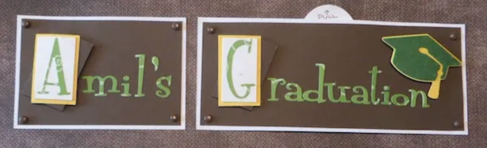
So I accented the first letter of each word by placing it on white and yellow rectangles to complement the page. But it still looked too plain, so I added brown rectangles, set them at an angle, and gave each letter a 3-D boost by adding pop dots.
It may not show on my photo, but those rectangles with the pop dots add interest without adding visual clutter.
Then, for a final detail, I added graduation caps that I made with my die cutter and brown brads at the corners of the title boxes.
JOURNALING
The 2-page layout was full, with little room left for journaling. But determined to include it, I added journaling in two ways--by handwriting the date and location in white ink on one page and also by hiding a pull-up journaling card under the title. (You can see the brown card with white writing here.)
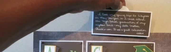 By handwriting the date and location in white ink on one page and also by hiding a pull-up journaling card under the title. (You can see the brown card with white writing here.)
HIGHLIGHTS
I told you that my layout is a busy one, but I used a couple of tricks to calm it a bit. One trick is to include same-sized elements set parallel to one another. That grid effect seems to calm the busyness when you use a lot of photos.
The problem with a grid, though, is that it can also be boring to look at. And so it was with my layout.
So I set two vertical photos at different angles from the rest, overlapping them a bit. That interrupted the flow just enough to add interest.
Finally, I added the graduate’s nickname to one page using yellow die-cut letters. And I “picked him out of the crowd” on two photos by placing a yellow open rectangle over his image.
Wrap-Up
Yes, I put a lot of work into my layout. And no, it wasn’t quick. But you don’t have to take nearly that much time making memorable scrapbook pages of your own. I get a kick out of this crafty art form; so I usually play a little.
If you’re normal and not obsessive like I am, I know you’ll make a beautiful layout and spend much less time creating it! So carry on, and have fun!
That’s it. I hope you’ll visit me on Facebook, reference this blog post, and share some of YOUR favorite tricks for making interesting layouts.
